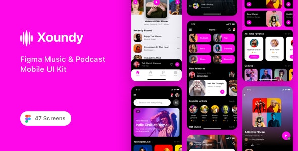
Xoundy - Figma Music & Podcast Mobile UI Kit

Xoundy is a great Figma Music & Podcast Mobile UI Kit designed for accelerate your online music, podcast industry and audio streaming application design process. It contains all 47 screens in layered and organized elements. Each screen fully customizable, easy to use and carefully assembled in Figma. This template is ready to use for iOS app.
Features
- 47 Screen Layouts
- Pixel Perfect
- 100% Vector and Customizable
- Layered & Well Organized
- San Francisco Fonts
- Designed based on 375×812 Screen Resolutions
- Designed in Figma
Pages Included
- Splash Screen
- Start 01
- Start 02
- Start 03
- Start 04
- Start 05
- Start 06
- Start 07
- Sign In 01
- Sign In 02
- Sign In 03
- Forgot Password
- Sign Up 01
- Sign Up 02
- Sign Up 03
- Verification Code
- Home 01
- Home 02
- Home 03
- Home 04
- Home 05
- Podcasts 01
- Podcasts 02
- Search
- Song Details 01
- Song Details 02
- Song Details 03
- Song Details 04
- Song Details 05
- Song Details 06
- Artist Details 01
- Artist Details 02
- Artist Details 03
- Artist Details 04
- Albums 01
- Albums 02
- Albums 03
- Playlists 01
- Playlists 02
- Account 01
- Account 02
- Account 03
- Account 04
- Navigation 01
- Navigation 02
- Navigation 03
- Navigation 04
Source & Credits
- Fonts: San Francisco
- Image: Unsplash
- Icon: Flaticon
How to Use Figma Files
Create a Component: Select the grouped object and make it a Component by using the Create Component icon above or via the right-click menu and selecting Create Component. Smart Selection: Smart Selection works automatically on any selection or group of 3 or more items with equal, uniform spacing.
Note
All images are just used for preview purpose only and replaced with Placeholder Images. They are not part of the template and not included in the final purchase files.
Please don’t forget to rate this item if you like it.
Thanks a Lot!